Introduction
VisitAarhus is the official tourist organisation for the city of Aarhus and the region of East Jylland in Denmark. The organisation provides information for both Danish and international tourists about the practicalities of their holiday, as well as inspiration for which attractions, activities and cuisine they can try out during their visit.
Fun fact: During this project, I got to use my 3rd language (Danish) in professional context (working and communicating with my teammates) for the first time.
Problem
Create a digital experience that inspires, informs and supports visitors by leveraging technology, storytelling and data collection
VisitAarhus needs a digital solution that identifies key points in the visitor’s customer journey, from arrival to exploration and activities at the destination. The solution must collect data on visitors’ preferences, behavior and interactions as they explore the destination. This may include which attractions they visit, their activities and their feedback. The purpose of data collection is to understand visitor needs and use these insights to offer tailored recommendations and better guest service.
How can VisitAarhus provide a solution which collects data about the visitors’ preferences and use it to offer tailored recommendations and provide better guest service?
Goal
The goal is to develop a digital product that enhances visitors’ experience by offering them relevant and engaging content, while at the same time collecting data that can improve future visitors’ experience of the region and contribute to the overall quality of the visit.
My role
- UX designer (drawing insights from research, creating the user flow of the solution)
During the project I took an active role in drawing insights from the research we were given by providing the team with various models and tools we can use for analysis, so we can understand the users and the challenge better. Besides that, I also outlined the user flow of the solution and facilitated the process of sketching and defining the structure of it. - UI designer (wireframing, mockups, prototyping, visual design)
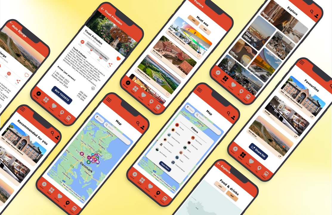
I took charge of wireframing and prototyping our digital solution in Figma. During the process, I also worked on the visual design by applying the visual identity of VisitAarhus and fitting their content about the attractions into the app.
The design process - from insights to interactive prototype
Getting to know the users
Different people, different ways to have a holiday
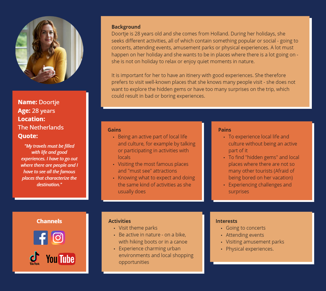
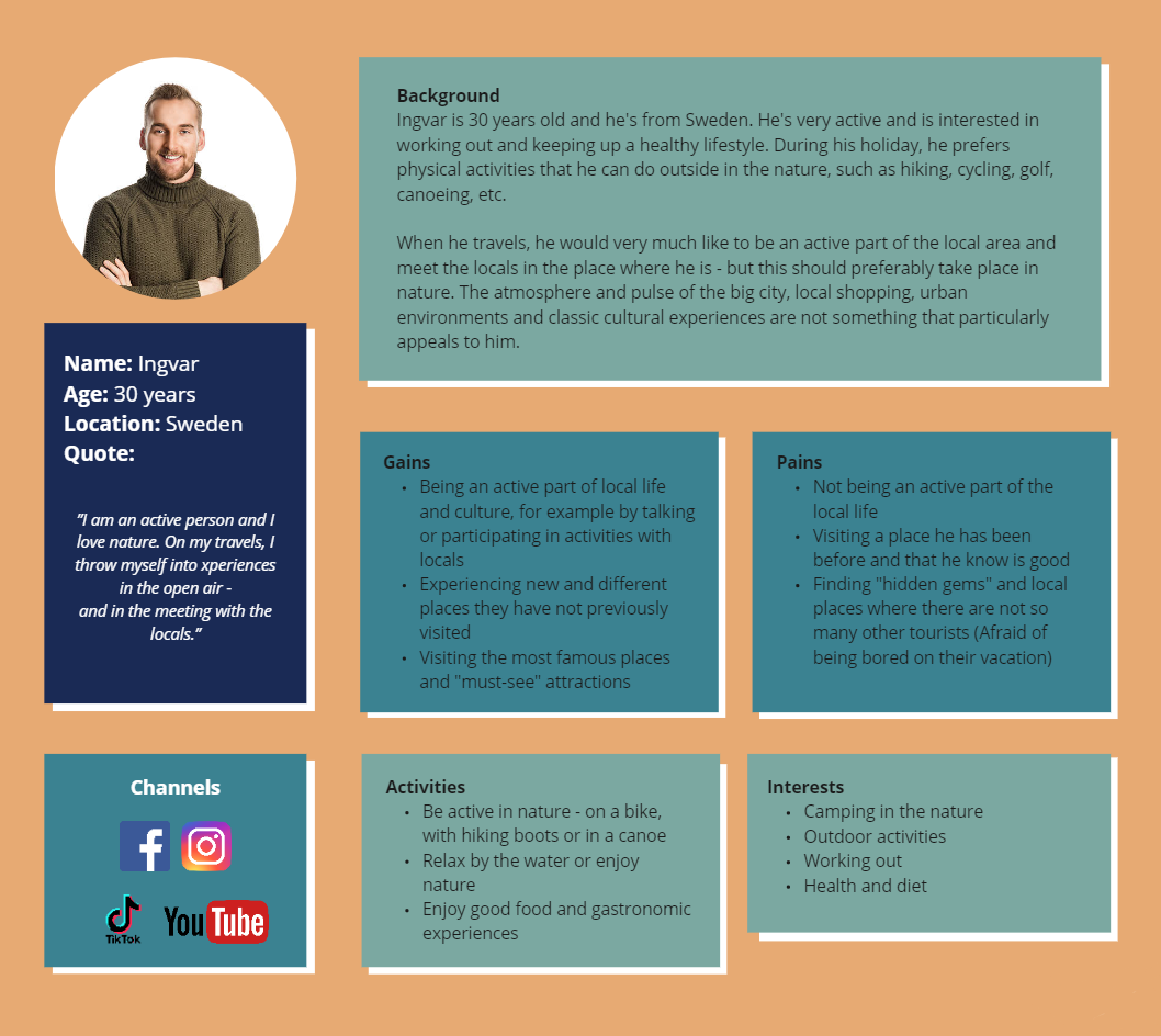
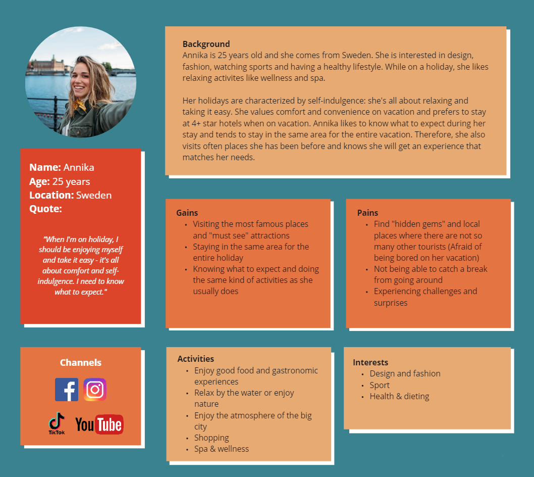
As part of having a case for VisitAarhus, we were provided with the target groups which they have identified. In total, they have identified 5 distinctive types of travellers. However, our group chose to focus on 3 of them which are getting their information and inspiration about upcoming holidays through digital media.
Doortje from Netherlands and Ingvar and Annika from Sweden are all avid travellers who love exploring new places. However, they differ a bit in how they’d like to spend their holiday. Doortje and Annika prefer having an itinery and knowing what to expect; they love exploring the urban atmosphere of the city they’re in. Ingvar loves being active outdoors and he prioritizes being involved in the local life and culture while on holiday.
Despite their differences in regards to how they want to experience their vacations and which activities they prefer, they’re all binded together by wanting to visit the “must-see” attractions of the destination.
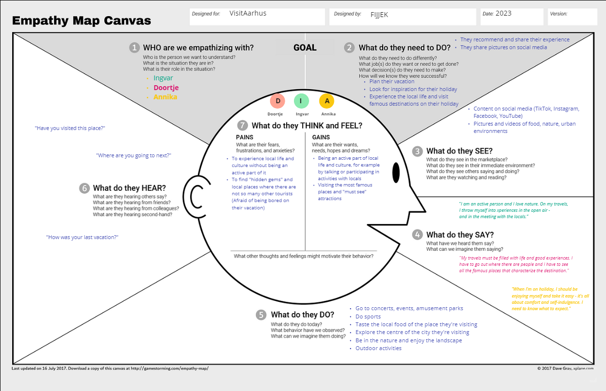
Empathising with the users and aligning the team
Doortje, Annika and Ingvar often use SoMe to share and recommend destinations with their friends. They use visuals (pictures, video) to show the cities they’re visiting, landscapes and local food they’re trying out. During their holidays, they typically either go to concerts and events, do sports and outdoor activities, explore the city and nature of the place they’re visiting and taste the local food of their destination.
A good holiday means visiting the “must-see” attractions, so they can share what they’ve experienced while travelling. Doortje, Ingvar and Annika would rather avoid finding “hidden gems”, as they worry that they might end up being bored if what they’re visiting isn’t well known, and thus they won’t have an interesting experience to share afterwards.
They want to visit, experience and share what they did and saw during the holidays. They find inspiration and recommend destinations through pictures and videos.
Generating insights from the research
Customer journey - from unawareness to advocating
We have worked on depicting the customer journey of the users, so we can understand their touchpoints with VisitAarhus and when it would be relevant to promote the product, how it could be customized, and what it could be further used for after they’ve visited Aarhus and the region of East Jylland. We divided the customer journey in 3 phases – before, during and after.
Bringing awareness to the Aarhus Region
The “Before” phase identifies the period from which the users are unaware/haven’t thought about Aarhus, East Jylland and VisitAarhus up to the moment they make the booking for their destination. During that period, the users can learn about VisitAarhus from campaigns executed both on digital and other media (ex. radio, TV). Those campaigns should be brief and provide quick inspiration of famous attractions in the region.
Awareness: making a destination visible for travellers
Once aware, the campaigns could provide information to the potential travellers, such as:
- Information about the chosen destination
- Recommendations of other travellers
- Visual content (pictures, videos) of the destination
When their interest is captured and the users interact with the SoMe content, analytics should be used to identify what’s popular among different target groups and cater the future campaigns specifically to what they appear to be interested the most in.
Planning: making the mundane easier with an app
During the planning phase, there should be more information about the practicalities to continue and make the process of potential booking easier. In that phase, the travellers would be interested in:
- Attractions and local experiences of the destination
- Local cuisine
- Transport
- Possible discounts
As they’re beginning to book tickets and accomodation, the digital product (app) could be introduced by placing an emphasis that they can find all that information in the app
Leveraging technology for a personalied experience
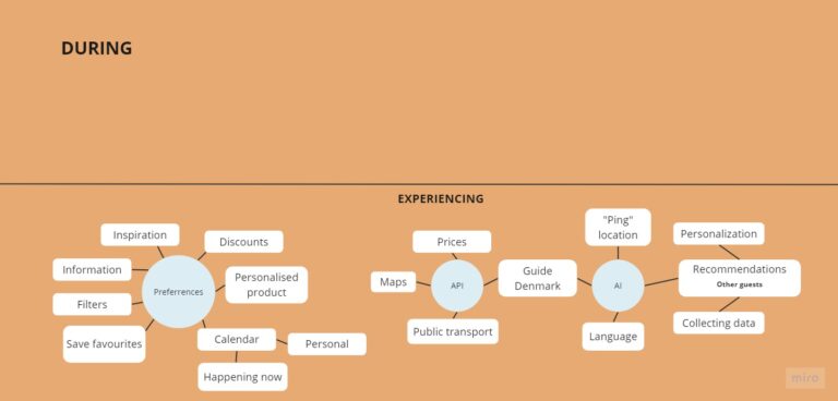
After the users install the app, they would be in the phase of “experiencing” – they’re going to begin interacting with the solution, so it’s important to identify how to leverage technology (data about preferences, APIs, AI) and give them personalized experience.
Preferences
Some of the information and functions which the app could implement to give them a tailored experience (after collecting data about their travelling preferences) for their needs include:
- finding travel inspiration for the trip
- information about attractions
- giving them potential discounts
- saving destinations they want to see as “Favourites”
- filtering out attractions according to criteria
API & AI
API and AI could potentially be used to provide the following functions:
- checking prices
- showing maps & public transport
- translating from another language
- showing recommendations from other visitors (if they’ve written something on VisitAarhus’ webpages)
- “ping” location
Post-holiday: travellers advocating for their experience
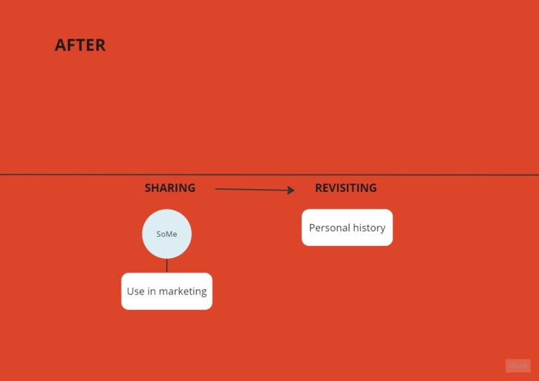
After the travellers have visited their destination, they can become advocates for the Aarhus Region and by telling about (and/or showing) what they’ve experienced. On social media, this can be in the form of:
- Recommendations: telling about their trip and what they’ve experienced, did and saw would be beneficial for any potential future visitors of the place. Positive reviews would build up a good image of the Aarhus Region, which would attract new tourists. Potentially, the app could also be mentioned as part of the recommendation, or the recommendations could be implemented in the app to help travellers make decisions
- Pictures/video: in times when most young travellers look for inspiration for their next trip on social media, it would make a lot of sense to encourage them to take pictures/video and share them, for example by tagging VisitAarhus’ accounts. In that way, VisitAarhus would get user-generated content on their account, and really good pictures/video could even be featured in the app
Feeling comfortable and being active part of the life around - priority on holiday
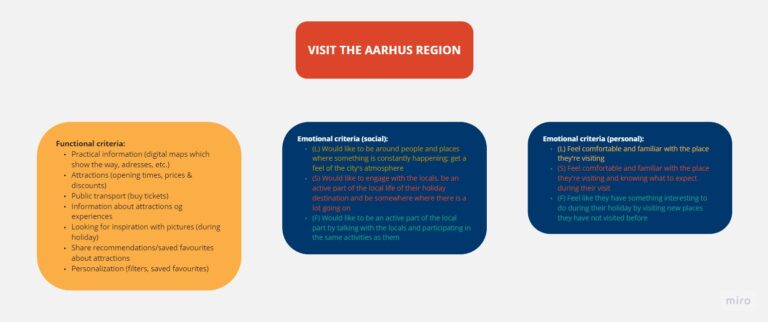
While on holiday, there’s a lot of practicalities which need to be arranged: transport, accomodation, knowing prices and opening times of attractions, managing the public transport, etc. But besides dealing with the practicalities of arranging a holiday somewhere, travellers also travel to fulfill their emotional needs and recharge in their own way.
- Feeling involved in the local life: the target groups share a need for feeling like they’re a part of the life around them on holiday – they want to have something going on for them and participate in the ongoing activities of their destination
- Feeling of familiarity and comfort: most people prefer being familiar with the place they’re visiting, they want to have a routine and itinery to follow while on holiday
The functional jobs which the users need to do in the digital solution (looking up information about practicalities, transport, opening times, prices, etc.) are part of ultimately coming to fulfill their emotional needs when they’re taking a holiday.
Outlining the journey and content of the app
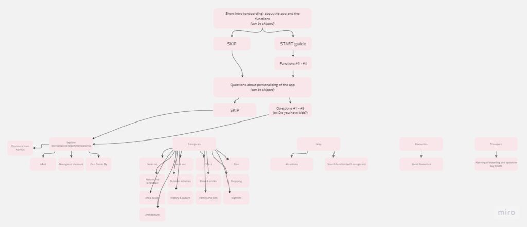
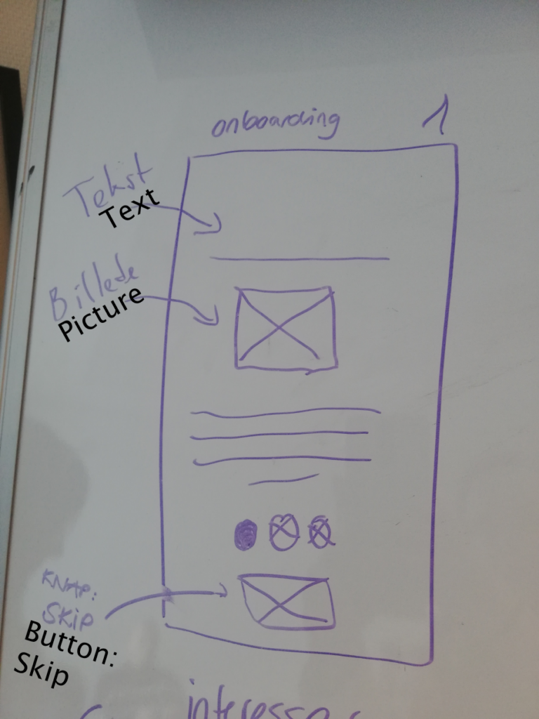
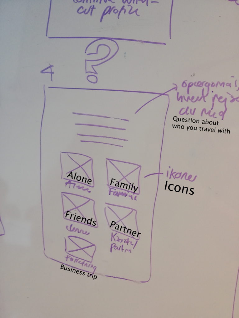
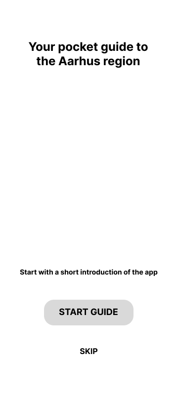
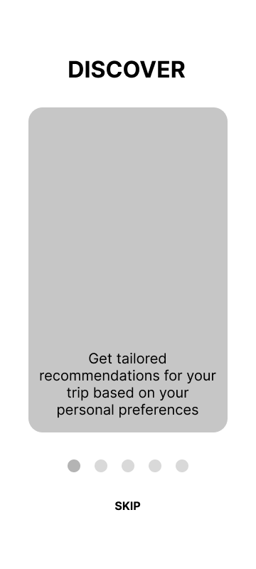
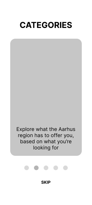
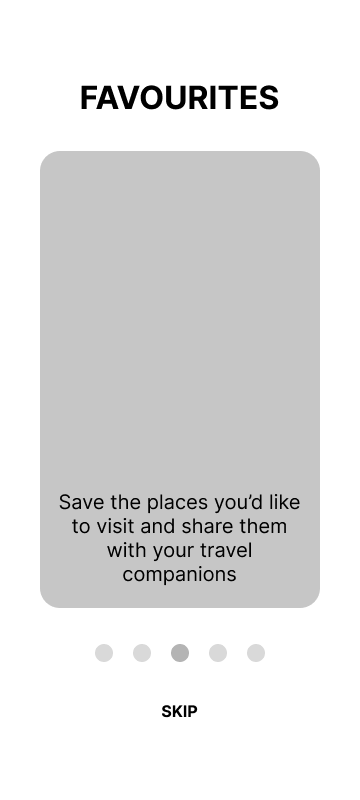
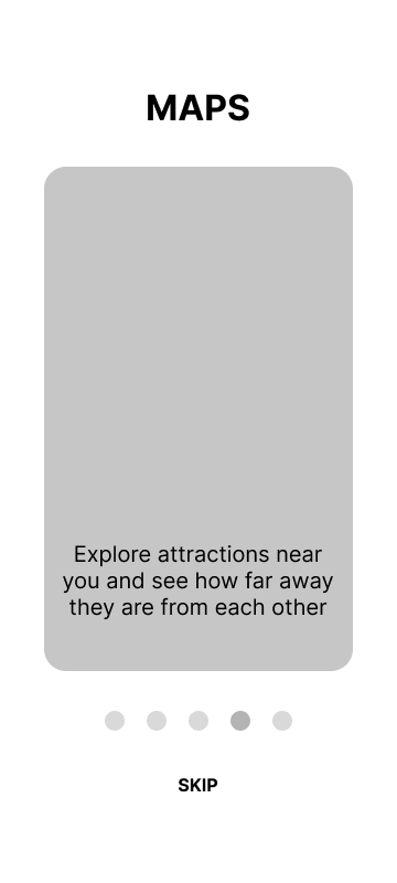
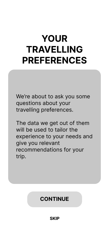
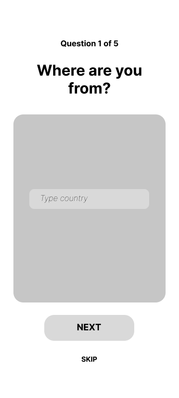
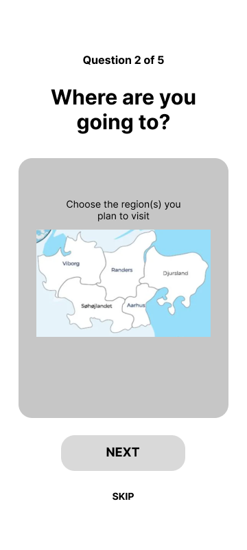
As a first thing, when users use the app for the first time, they’d be welcomed by a skippable onboarding (if they need a walkthrough of the app’s functions), and afterwards, they’d get questions about their travelling preferences, so the app could be tailored to their taste. Those questions cannot be skipped, as they’re necessary for customizing the app according to the user’s wishes (and that’s one of the value propositions).
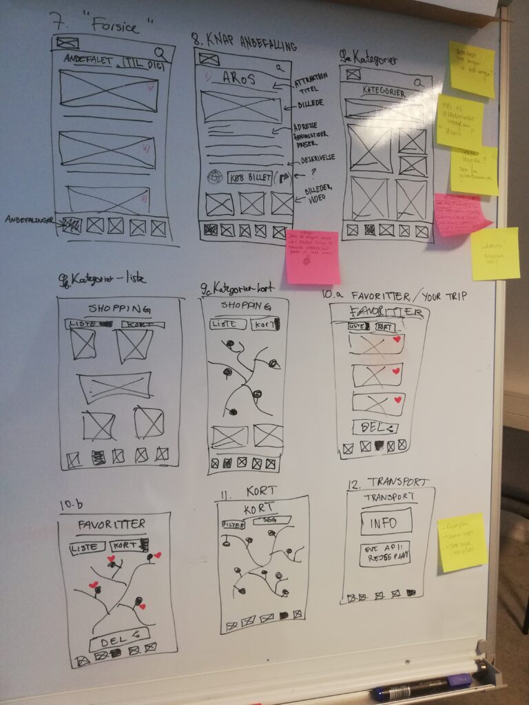
The digital solution would have five core menu categories:
- Explore: the “feed” of the solution – this is where the users would get recommendations for attractions to visit
- Categories: contains all of the attractions in the region split into different themes (ex. nature, architecture, history & culture, food and drinks, etc.)
- Map: showing the attractions and their proximity to the user; contains the option to search and filter out what they are looking for
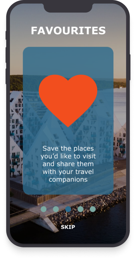
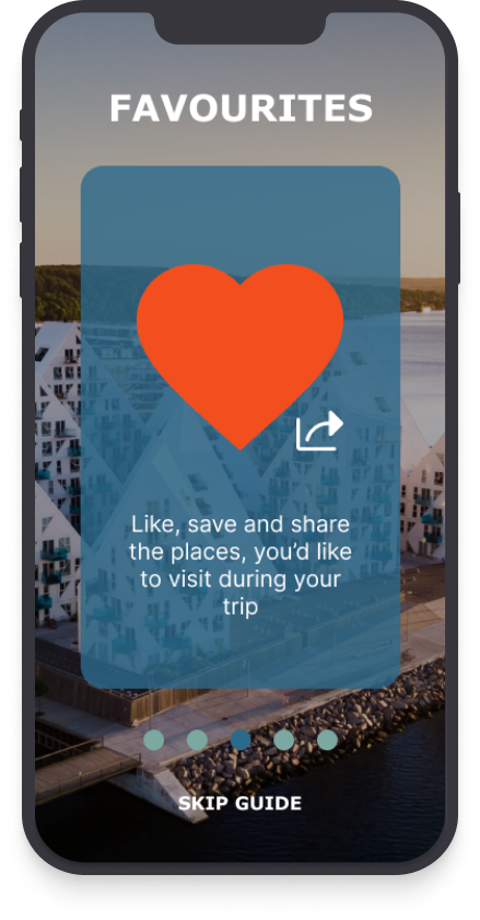
- Favourites: if the user “likes” an attraction they’d like to visit, they can see it in their Favourites
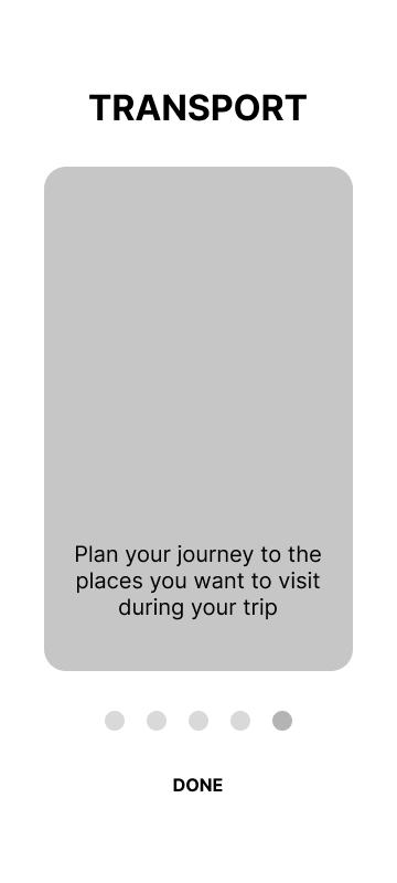
- Transport: the user can see their transport option, buy tickets and plan on how to get around the place they’re visiting
Making the idea tangible
Sketching: important considerations coming to the surface
After defining the user flow, the whole team got on board with sketching the potential solution. During our sketching process, we took many questions into consideration, the most important being:
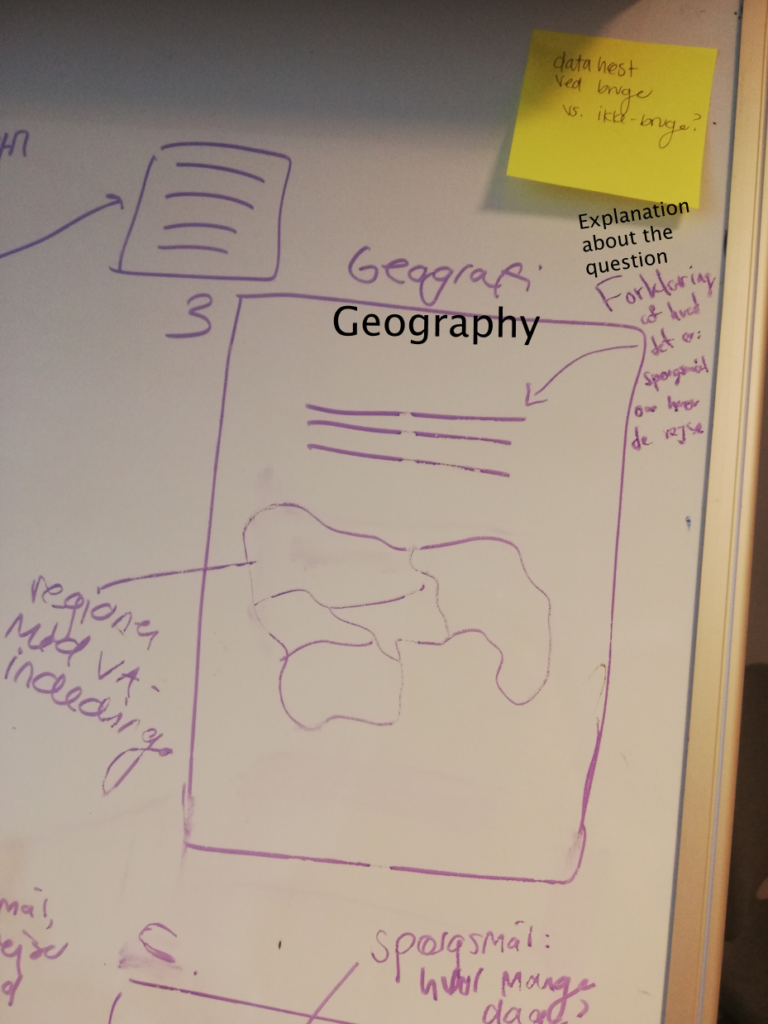
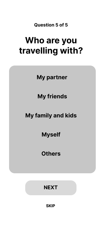
- What would be relevant questions to ask the users in regards to their travelling preferences?
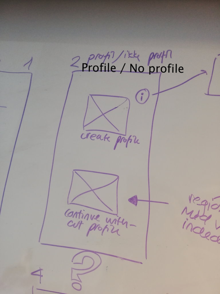
- Should users make a profile to use the app? Can demographics data be collected without making a user profile?
- Should the users be able to skip the questions about their travelling preferences?
- What should be the app’s language?
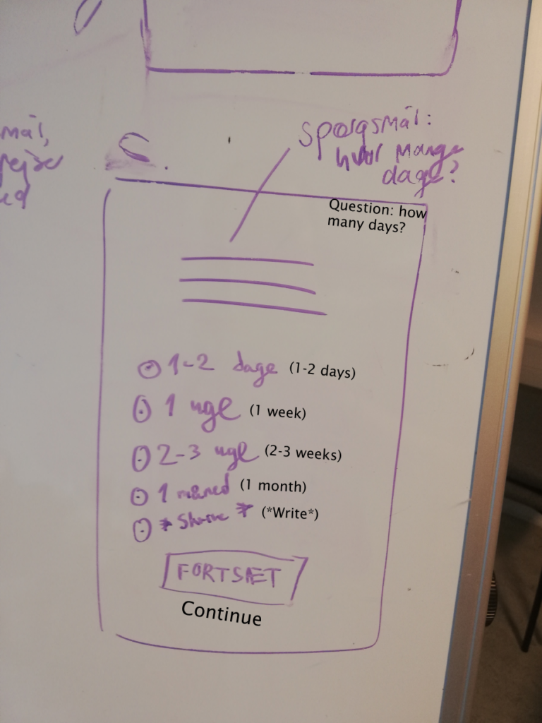
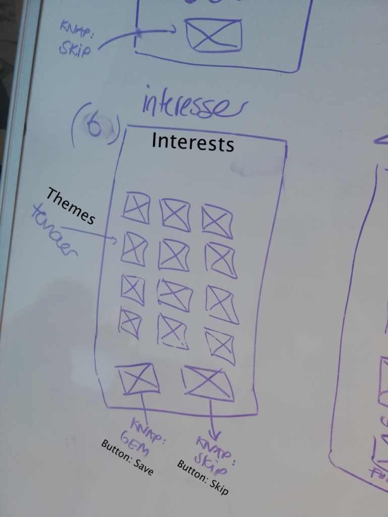
The onboarding part was crucial of the digital solution, as this is where the data collection takes place (after the introduction of the app). The data collected is used to give the users tailored recommendations for their visit. We have been closely collaborating and discussing our progress with VisitAarhus’ case presenter to ensure that we deliver a solution which can help them.
Wireframing - paper made digital
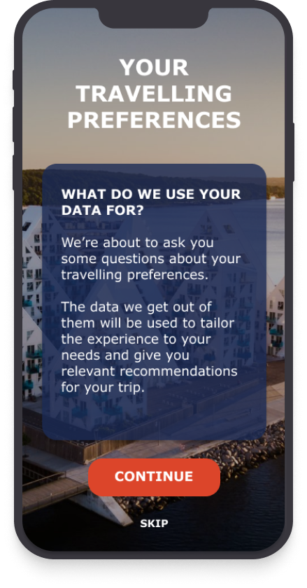
During our wireframing process, we took the sketches from the onboarding part (introduction to the app + questions about preferences) and made them digital, thus making the “skeleton” of that part of the solution. We placed emphasis on structure and copywriting – the written explanations should be concise and clear, inspiring trust and showing transparency in regards to how and why the data collected is being used.
Think aloud: how do users perceive the onboarding?
For our testing, we used the “Think aloud” method – we encouraged the people who tested our solution to share their thoughts, feelings and opinions as they go through the onboarding. We tested the solution with a hi-fi prototype, because we also wanted to get feedback on the visuals of the app. With our testing, we wanted to gain insight and understanding on the following matters:
- How do the users perceive the introduction and the following questions – would they be willing to give their data?
- Do they get what the app and the functions are about?
- Do they like the visuals (colors, images) of the apps?
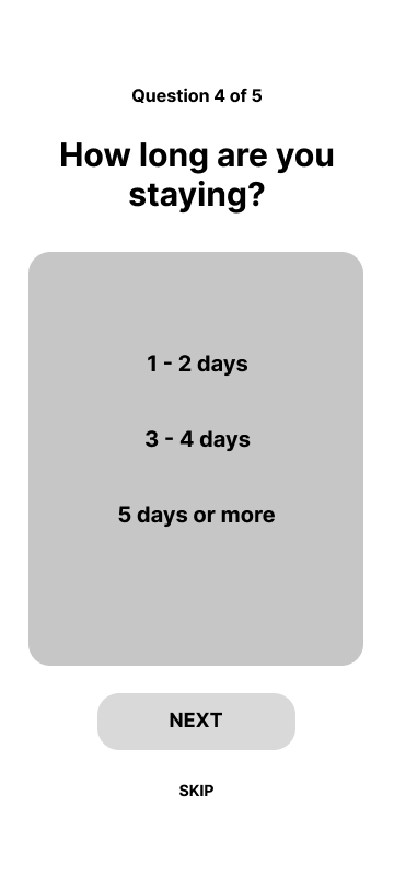
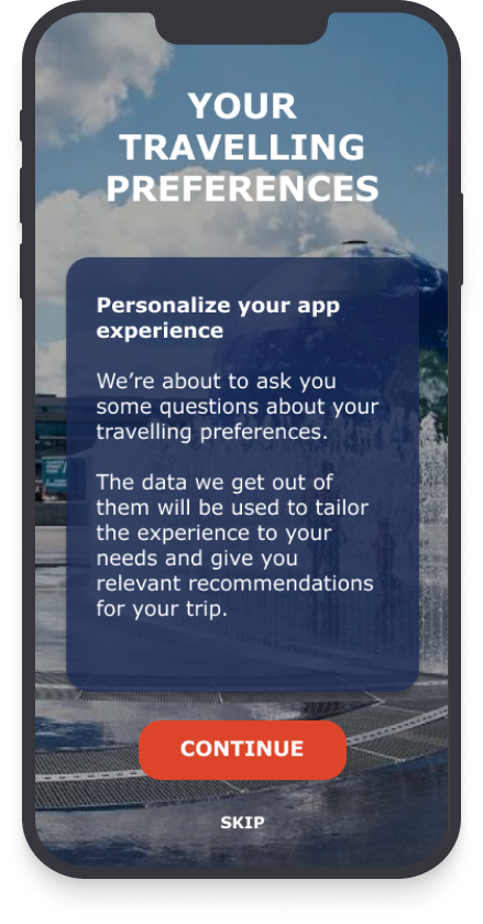
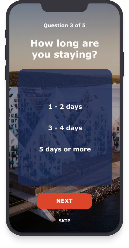
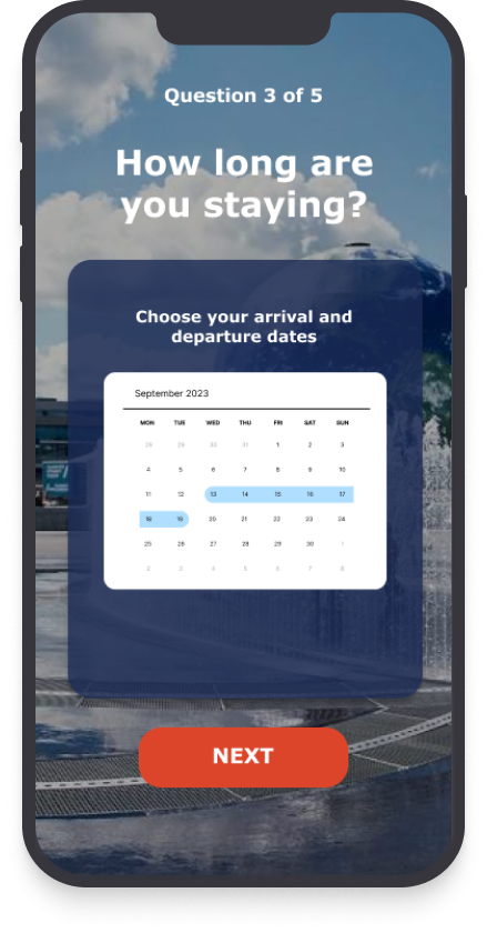
The most important changes are reflected in “Favourites”, the introduction to the questions and the question about the length of stay.
- Favourites: we added a little “share” under the heart because the users thought it would depict the option of sharing well – just like the heart, that icon is frequently used on social media. More subtle change “Skip” has been renamed to “Skip guide”, so the users know it’s only the guide they would be skipping and not the following questions as well.
- Travelling preferences: the users wanted to see a change in the background after the intro to the app ended – it would be more obvious to them that they’re in a different part of their journey through the app. Besides that, putting the reason for collecting their data as a headline instead of the headline being a question, makes it more straightforward, and they can get what it is about without having to read further
- Length of stay: the users thought a calendar makes more sense for answering how long they’re staying – they want to pick their dates of arrival and departure to the destination. On another note, “Skip” is not an option if the users are in the middle of answering the questions – skipping questions may lead to inconsistent data.
Curious about our prototype? Try it out here 
Project aftermath
The project was part of the postgraduate course “Digitalization and business development” – an intensive course which included theoretical lectures about the digitalization process in a business context and practical case work for a company. During the project, we were closely collaborating with the case holders and we’ve exchanged ideas continuously together.
At the last day of the project, we pitched our solution and marketing strategy which we made for VisitAarhus. Our fellow classmates as well as the case holders were “widely impressed” at our final result – our team managed to cover and address many of the challenges we were presented with in a short time.
We were also proud of the result, our collaboration and the synergy which we had in the team. Each of us had their own contribution to the project, and it was thanks to our initiative, active involvement, structure and consistency that we achieved such a great result.
Reflections and learning
I was the only UX/UI designer, and as far as my personal contribution is concerned, I think I did a great job in the beginning of the project by guiding the team on how we should work with the data we were given – that includes drawing insights which were used to make informed design decisions. I facilitated a short sprint during the 1st week and by the end of it, we already made sketches – the part where we all gave input on the structure of the app. Afterwards, I continued to work in Figma with wireframing and making a clickable prototype.
To sum up, this is the project where I got overall more confident in my facilitation and design skills. I got more experience working in Figma and interest in learning more about the wonders it can do.
