Introduction
Edufit is a startup that offers a platform which makes it easy to incorporate exercise in the classroom. The target group is primary school students and their teachers. The platform of Edufit contains fun, high-energy games which can be used as an exercise activity during school breaks and quizzes that can substitute Kahoot. Students have the option to compete individually or as a team.
Challenge
Redesign the platform to better accommodate the future development of user profiles and features while improving the overall user experience
As a startup, Edufit is in constant development and continuously comes up with and rolls out new features. They already have an existing digital product that is used by hundreds of users on a daily basis. When I stepped into the role of a UX/UI designer, I was met with the challenge of redesigning the current platform with a focus on improving its usability while also taking into consideration the next features that were going to be implemented.
Areas of work
- UX design
I began the process with a usability evaluation of the current platform to find out how to improve usability. Based on the insights from it and knowing the future features which need to be implemented, I continued working on information architecture for structuring the content, and finally, I started sketching and wireframing as a way of coming up with different solutions to the problem.
- User Interface/Interaction design
I made an interactive hi-fi prototype in Figma where I depicted the basic interaction of the “hover” effect. During the process of prototyping, I implemented the style guide of Edufit and worked on a button component set, which is now a fundamental part of the design system and can be used as a reference by the next designers as well as for handoff to the developer.
Redesigning the platform: step by step
Usability Evaluation
As the only designer on the project and the internship, I had a lot of freedom in regards to how I structure my work and which methods and tools I choose to work with. However, I had a limited time of one month and no direct access to the users from the target group. In that case, I did a usability evaluation (see Jacob Nielsen’s 10 Usability Heuristics for User Interface Design, nr. 8, 10) to start my process and find out areas for improvement.
Key Insights
- Contact information is currently in 3 places (“Home”, Security and Contact)
- Home, Help, News, Security and Contact are all sidebar category pages containing mostly text
- “Missing” Home page (can be accessed only by clicking the logo)
- Missing “Classes” category
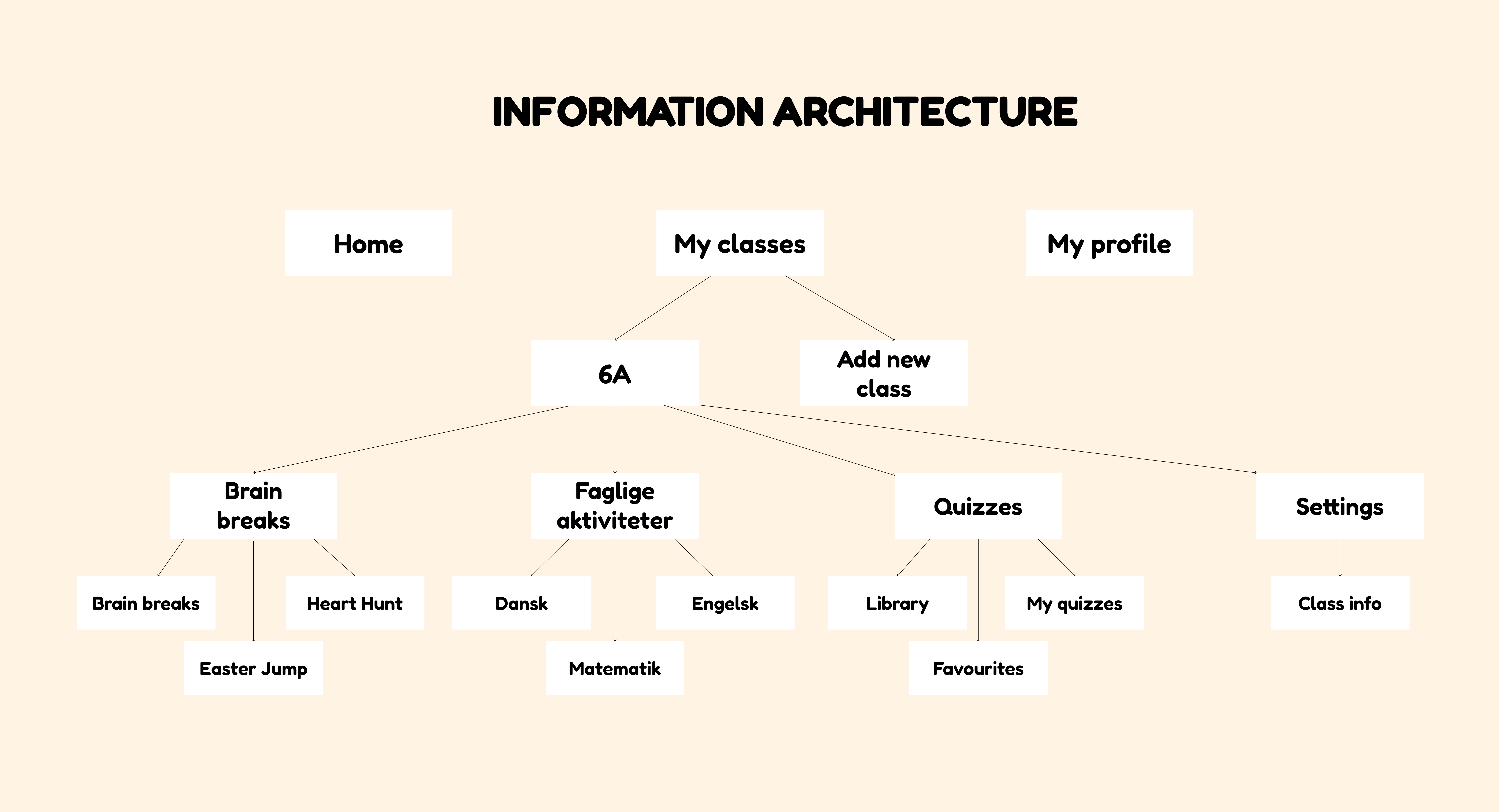
Information Architecture
As a result of the Usability Evaluation, the Information Architecture of the sidebar menu was made with the intention of minimizing the number of current menu items and reducing repeated information so that there was more space for the upcoming new features. I also had a meeting with the owner/developer of Edufit to get a better idea of which menu items would have to be nested within others and what the intention is for the future categorization of features.
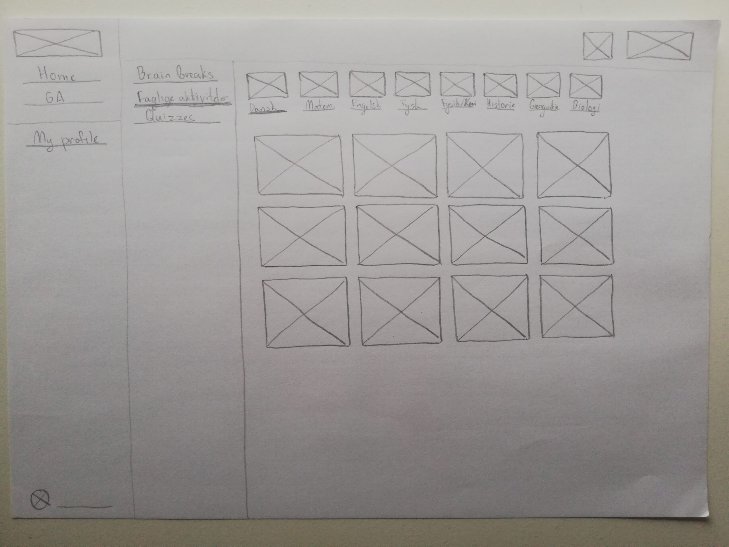
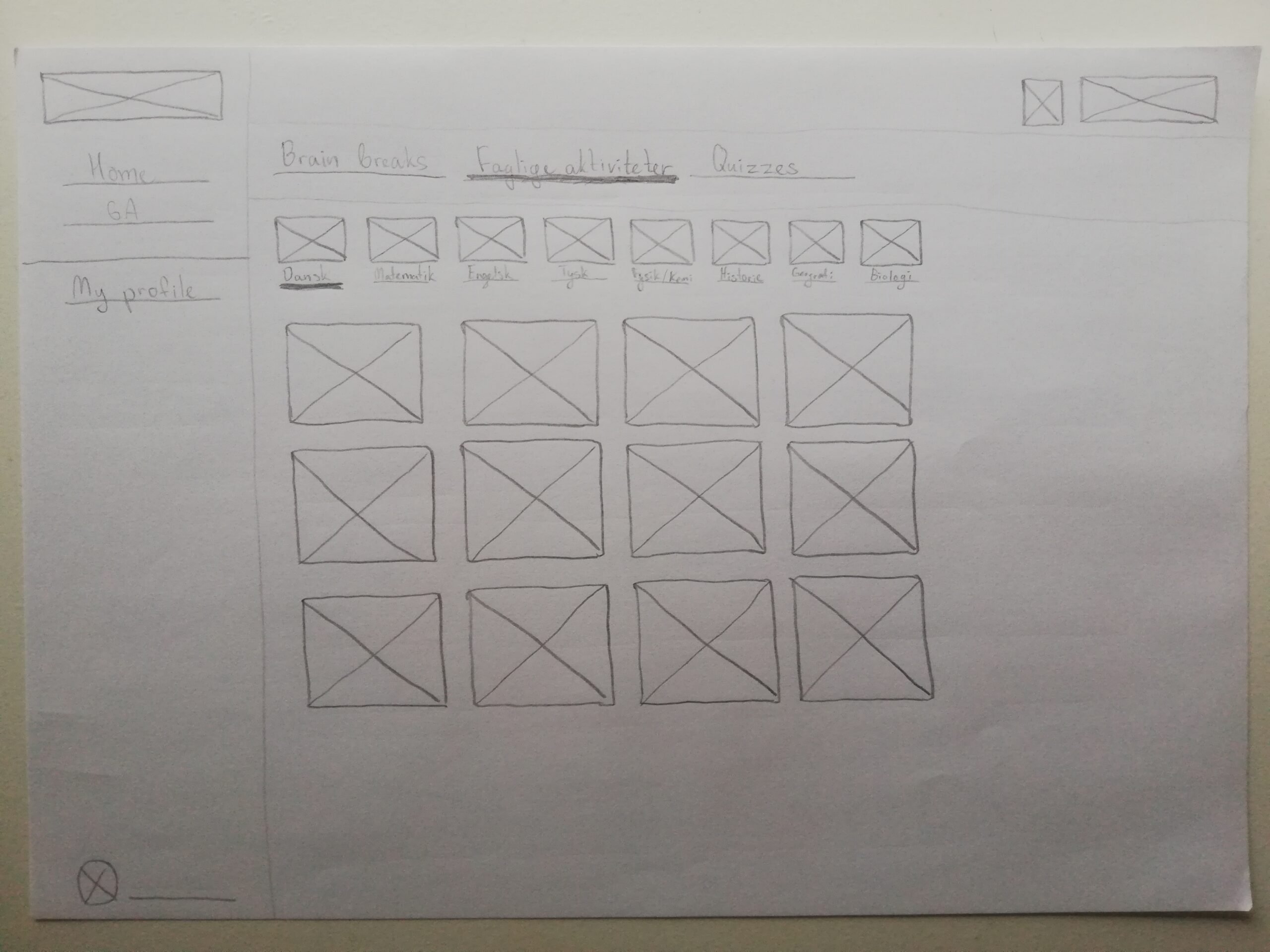
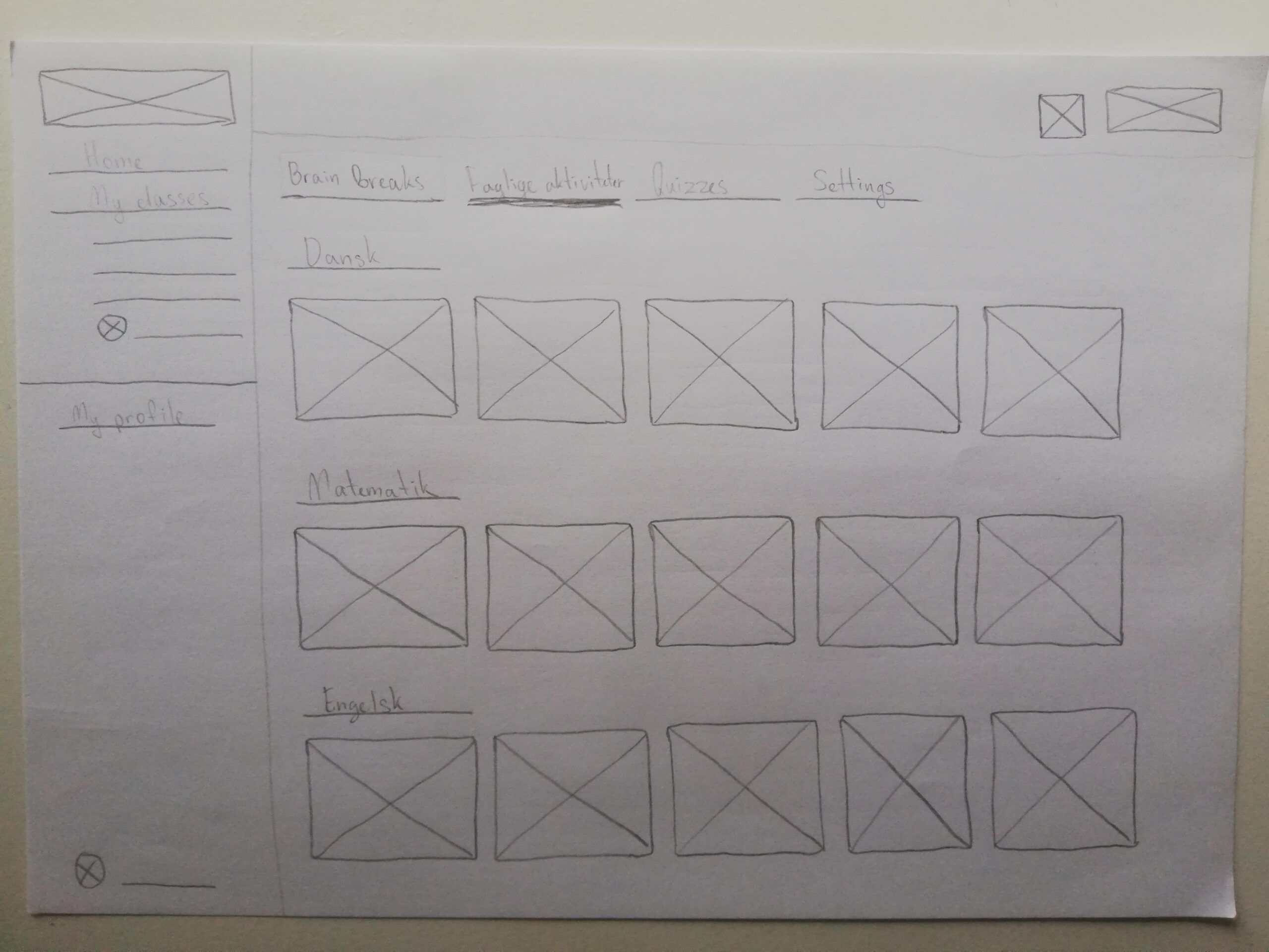
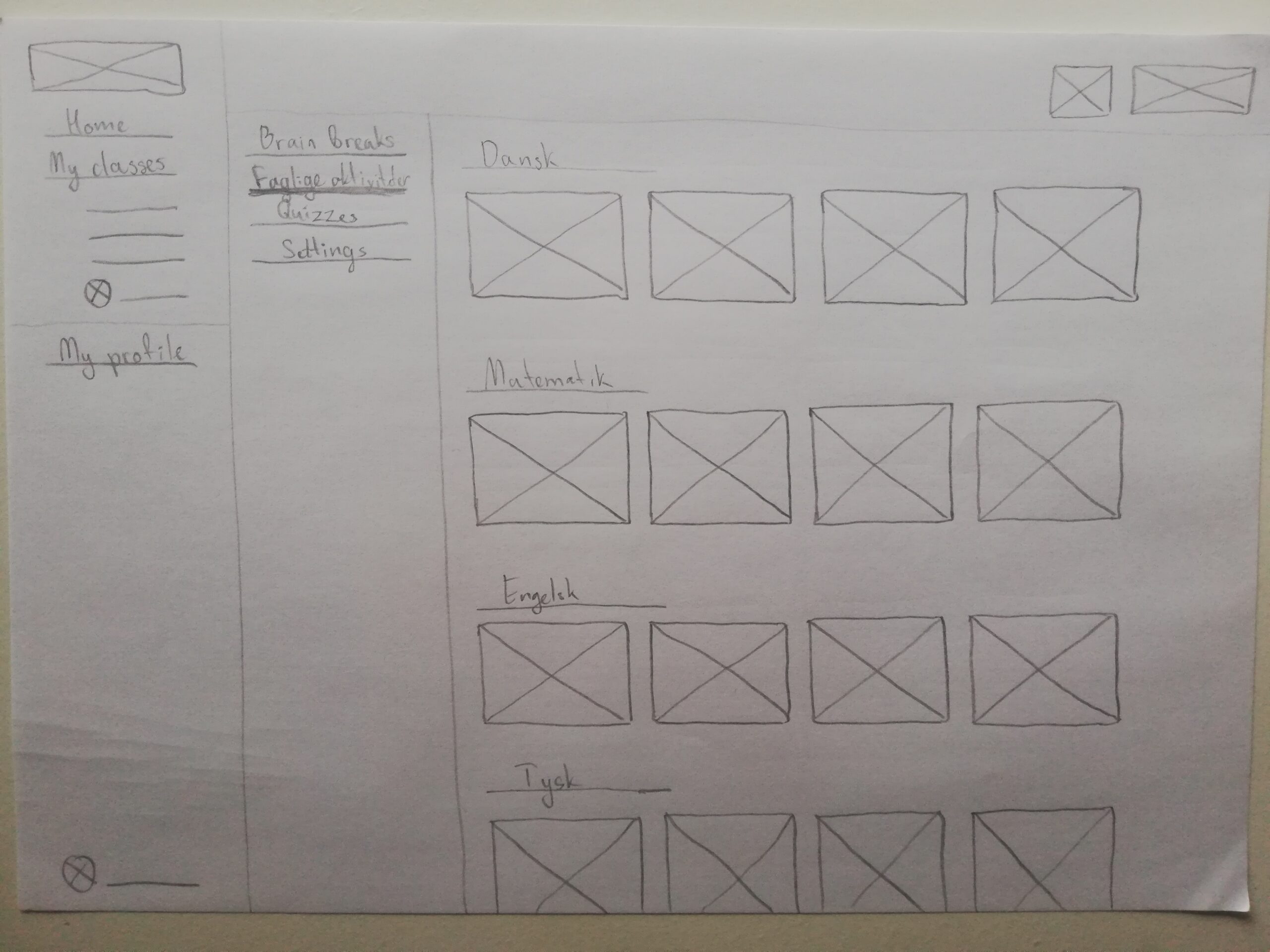
Sketching
During the process of sketching, I mainly took the time to explore how the menu items within the dashboard categories could be structured, as well as how the various games could be displayed. Below you can see the different proposals for the “Faglige aktiviteter” page.
When sketching, I tried to depict two different ways of presenting the available games and quizzes – one approach giving a helicopter view of all the subject categories and games, and the other one placing an emphasis on each separate game.
Eventually this was solved by a third different option where a “filtering” option would be available, eliminating the need for categorization according to subject.
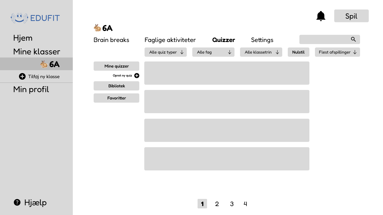
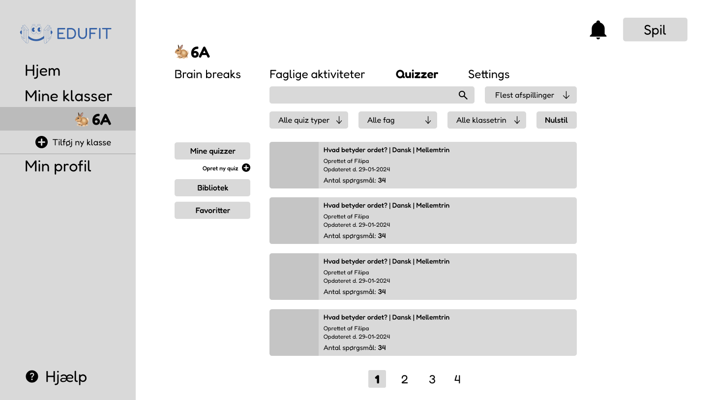
Wireframing
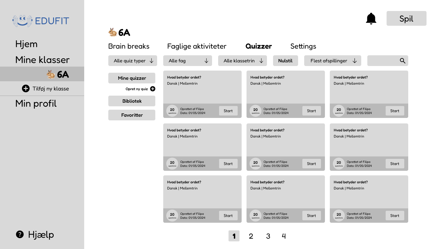
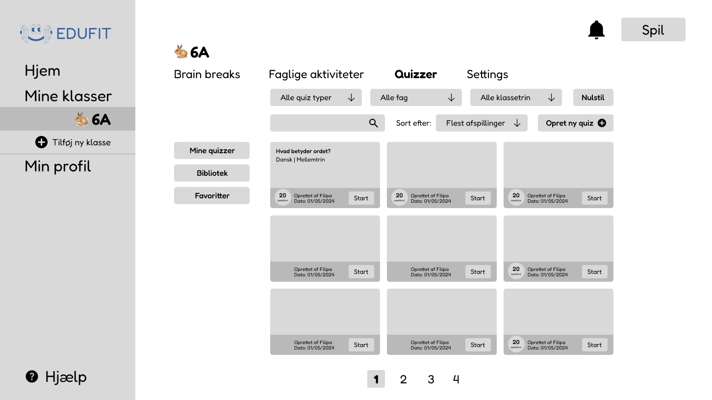
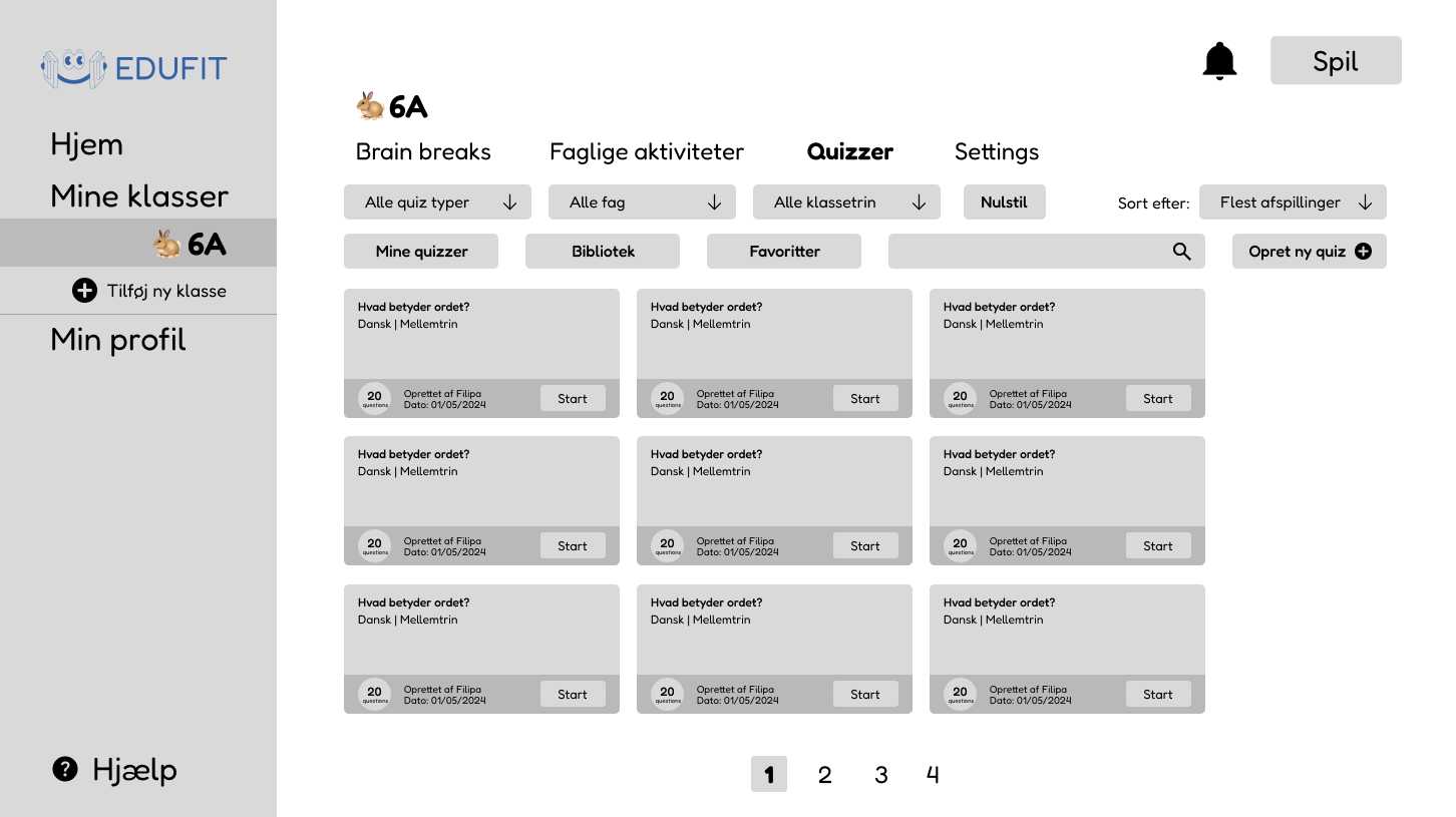
Another challenging page was the one with quizzes. Besides figuring out how to present the quizzes in the most compact, easy-to- scan way for the user, there was also a search bar, searching criteria, and internal menu items that had to be fitted into the screen.
The “card” way (see wireframes 3,4,5 below) of showing the quizzes seemed tempting to do at first, but the main problem was that the text would be too small to read and it would look cramped, thus compromising accessibility in terms of readability. Another concern was placing the searching criteria in such a way that there would be enough white space giving the design a space to “breathe”. In that regard, some of the designs (wireframes 3,5 in particular) seemed overwhelming, with a lot going on visually.
The search bar and sorting criteria in the first wireframe make the space around the rest of the menu items which are part of the class page. Moreover, if the search is placed like that, it could cause confusion that the search criteria applies to all the other parts of the menu, not just the Quizzes page.
Design system
When starting the process of making mockups, there was already a style system consisting of fonts and colors. With my redesign, I got the challenge of working on a design system that has a button component (one of the most commonly appearing elements across the prototype). I had a talk with the developer, who told me about his expectations and explained to me how design translates into code. In that way, I got a better idea of what properties the button should contain and why they are relevant.
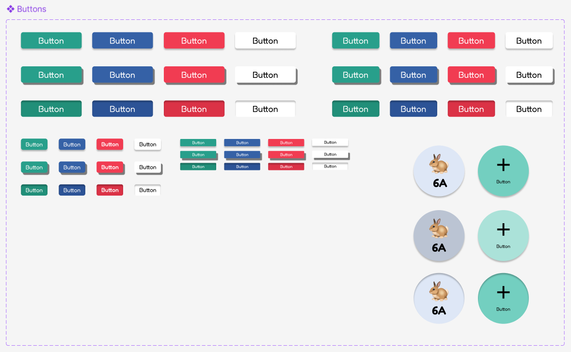
When making the button component, I first started by looking at the design system of shadcn/ui to understand how components change according to their properties. Then, I allocated some time to watch tutorials and learn more about the different types of properties and how to use them.
In this case, I worked with the variant, instance swap, and text properties to make buttons that change according to their size, state (default, hover, pressed), type (primary, secondary, tertiary, destructive), and shape.
Reflections and learning
Lorem ipsum dolor sit amet, consectetur adipiscing elit. Ut elit tellus, luctus nec ullamcorper mattis, pulvinar dapibus leo.