Arla - an industry leader
In this project, we had Arla as our client, one of the leading dairy companies in the world, owned by farmers. Combining nutrition and health with climate action, their goal is to make dairy production more sustainable. In every step of their journey, Arla aims to reduce CO2 emissions while encouraging healthy habits and diet, caring for both the planet and people.
Problem
Help Arla’s farmers enter data about CO2 footprint easily and nudge their interest in sustainability
Arla is to provide the farmers with a solution that should:
- support their efforts in reducing CO2 footprint by measuring performance
- nudge their interest in sustainability
- help them benchmark with other farmers
The challenge of this project is making the data entry process user-friendly and easy for all of the farmers.
How can Arla make it easy for their farmers to enter data and nudge them to continuously collect and contribute data about their carbon footprint?
Goal
The goal of this project is to design a solution which fits the needs, engages and helps two different target groups (in regards to digital literacy) fulfill their objective of filling in data about their carbon footprint.
My role
- UX designer (research, wireframing, mockups)
The project was done in collaboration with 3 of my classmates, all of us specialising in UX design. I was actively participating in the design process by doing research, sketching and making wireframes together with the others - Project management
An area in which I took charge was project management. I was facilitator and time keeper of our meetings, and made sure all of the requirements for the project are met within the timeframe we are given.
The design process - the good, the bad, the ugly
Research: who, what, how
Meet Casper and Henry - the polar opposites
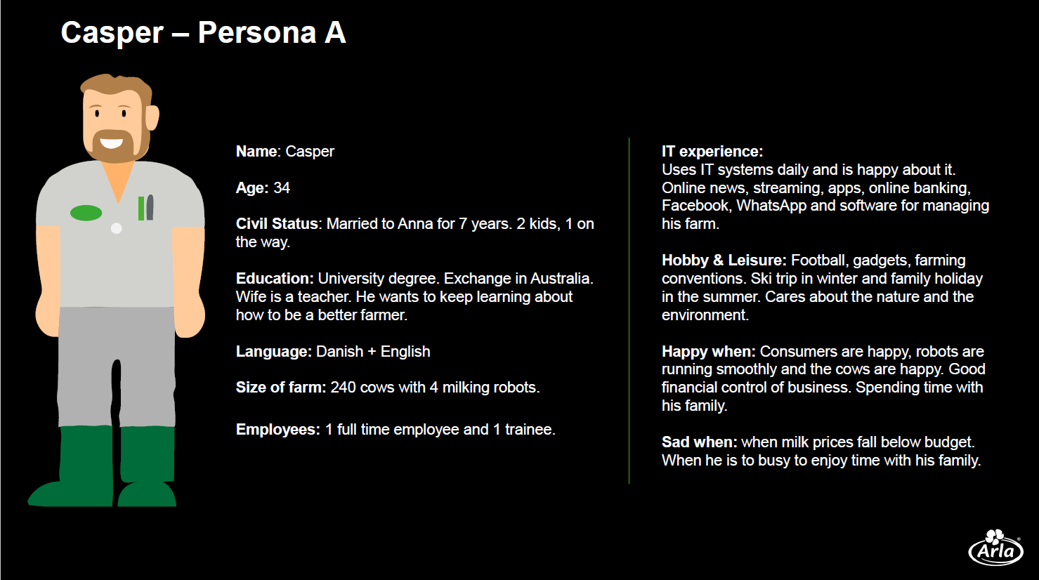
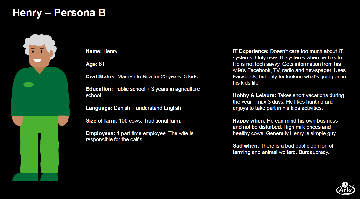
Arla provided us with two target groups which we have to take into consideration when designing the solution. Both of them are farmers with varying levels of digital literacy and frequency of usage of IT systems.
Casper is a young farmer who’s familiar with the digital world – he’s on social media, uses apps and streaming services, and reads online news. Next to him, we have Henry, who prefers to get information from other types of media and only uses IT systems when he needs to.
Both of them have different levels of digital literacy and usage of IT systems, so the system needs to cater to both users.
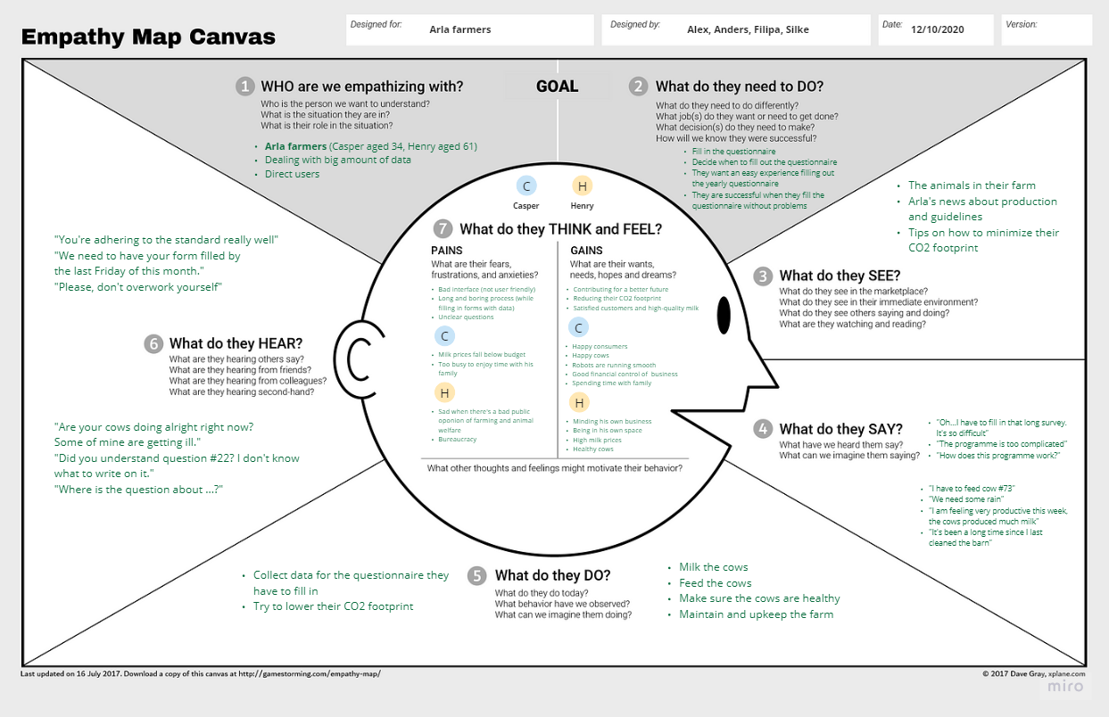
Getting in the shoes of the farmers
The farmers of Arla are direct users of the solution, and they need to fill out a questionnaire quarterly. They want an easy experience filling out this questionnaire, and they also need to choose and set aside time to fill it out.
The farmers want to contribute to a better future, provide the best quality milk, and satisfy the customers while aiming to reduce their CO2 footprint. While trying to lower their footprint, the questionnaire and the system could get in their way if the questions are unclear, the process is time-consuming, and the solution they’re using is not user-friendly.
The system should help the users achieve their goals. The farmers need an intuitive, user-friendly solution.
A concept taking form and shape
Problems 🤝 solutions
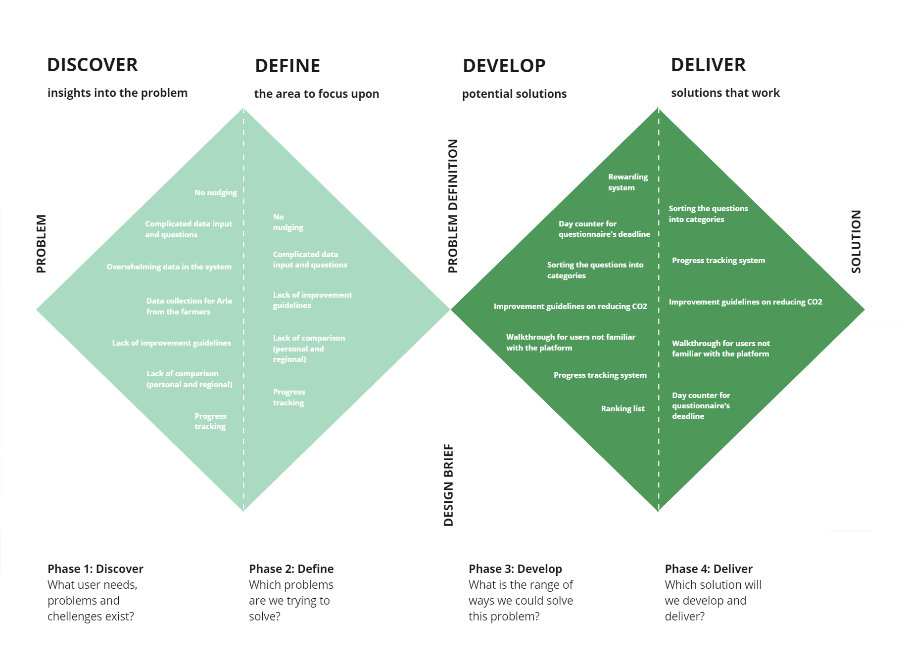
After getting the team aligned about the users we’re designing the solution for, we decided to dive into the problems they have to deal with. We used the Double Diamond which helped us discover the problems, define what we’re going to focus on, brainstorm for solutions, and decide what we’re going to work on implementing
We decided that the areas to focus upon are:
- Nudging
- Making data input and questions understandable
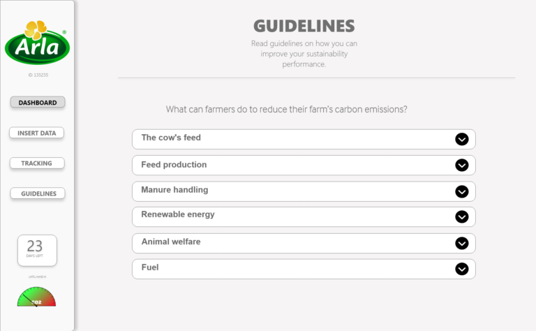
- Providing improvement guidelines
- Tracking progress
- Provide way to compare progress
And to make a fulfilling user experience we need to:
- Provide a day counter for the deadline of the questionnaire
- Make a walkthrough for users who may not be familiar how to use the solution
- Sort the questions into categories
- Make improvement guidelines
- Make a progress tracking system
The journey through the solution
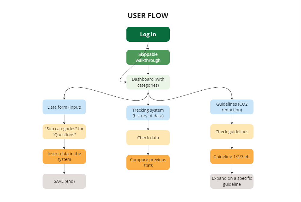
Mapping the user flow helped us to illustrate what the users must use the system for. The solution is all about an individual farmer’s data and the point of it is to deliver their stats, track their performance over time to see if they’re improving and provide guidelines on how to do better and reduce their CO2 footprint.
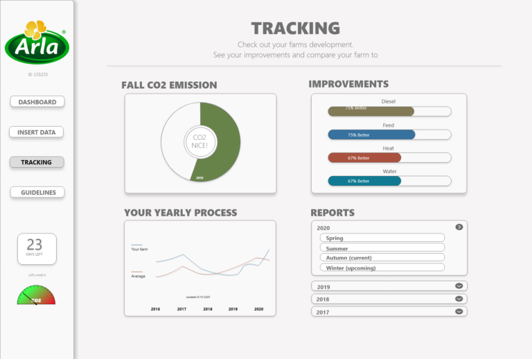
A tracking system featuring history of their data is an individual comparison of a farmer’s own improvement – it’s a must for them to know whether they’re continuously improving.
Making the fluff concrete
Sketching: the gateway to possibilities
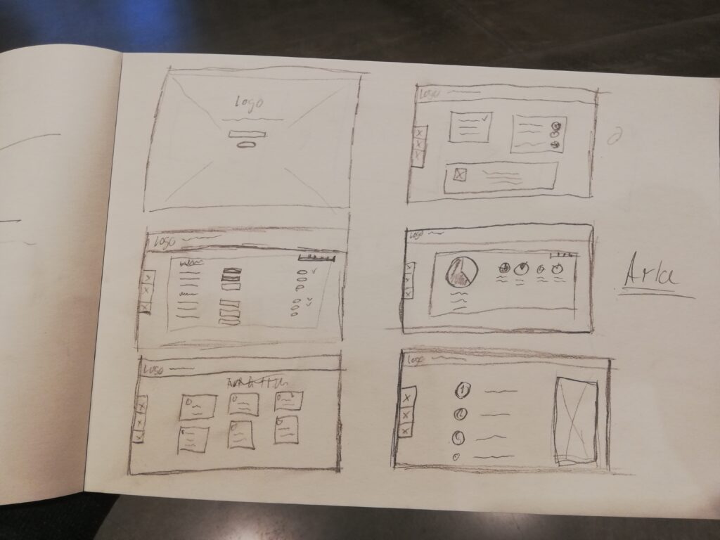
We began the process by making some rough sketches of the pages. They were meant to quickly illustrate a possible way of how elements within the page could be positioned and what kind of content (pictures, text, graphs) could be possibly there and the way they could be related to one another.
During the sketching, everyone in the team got to be creative and then share their ideas about the layout. Deciding on how to structure the pages was certainly challenging, and we had a lot of discussions on what would be the best thing to do.
From "analogue" to digital
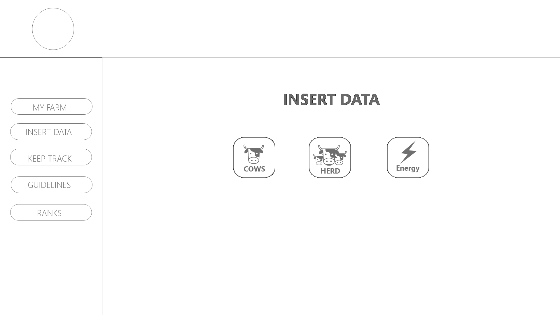
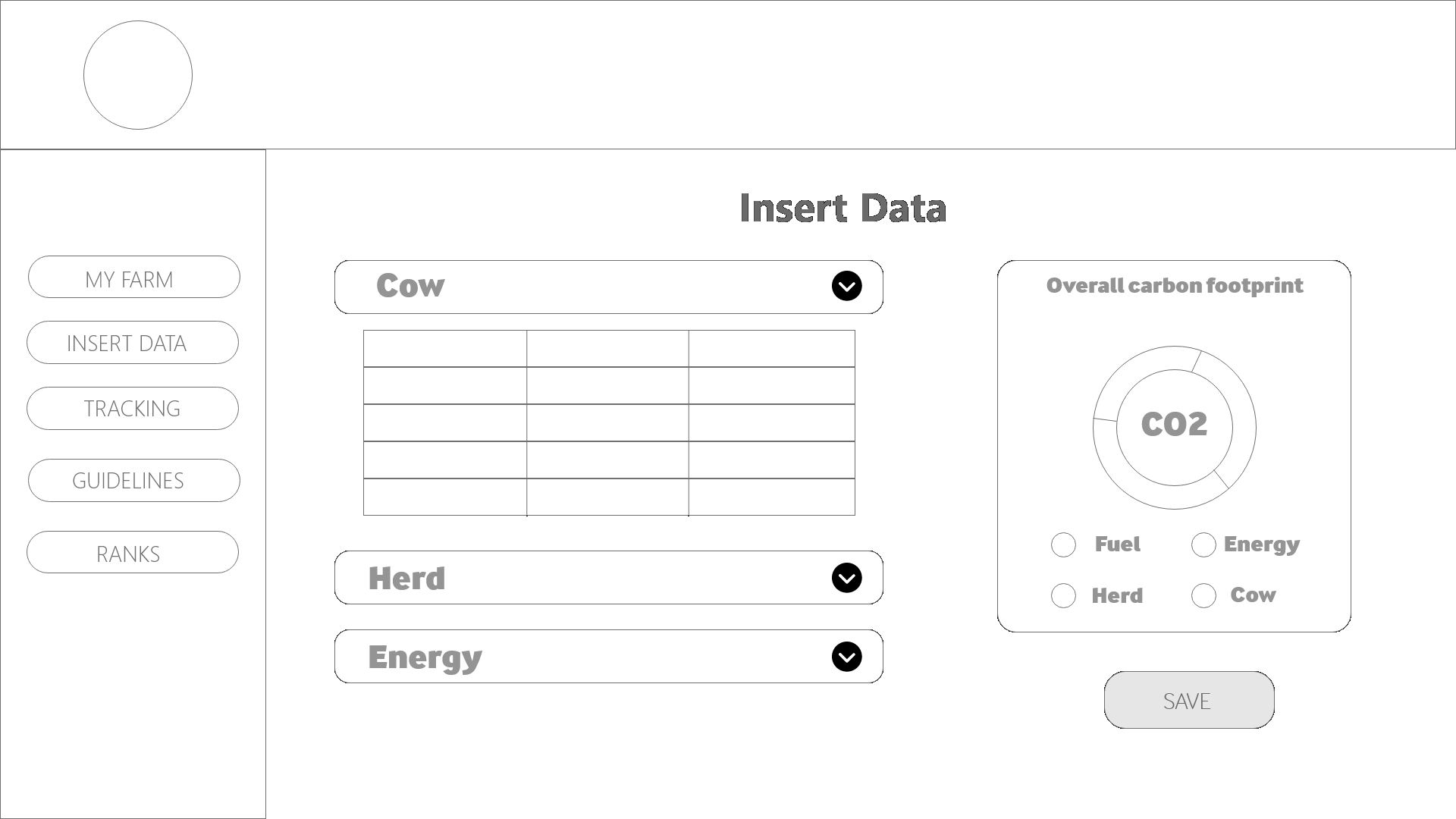
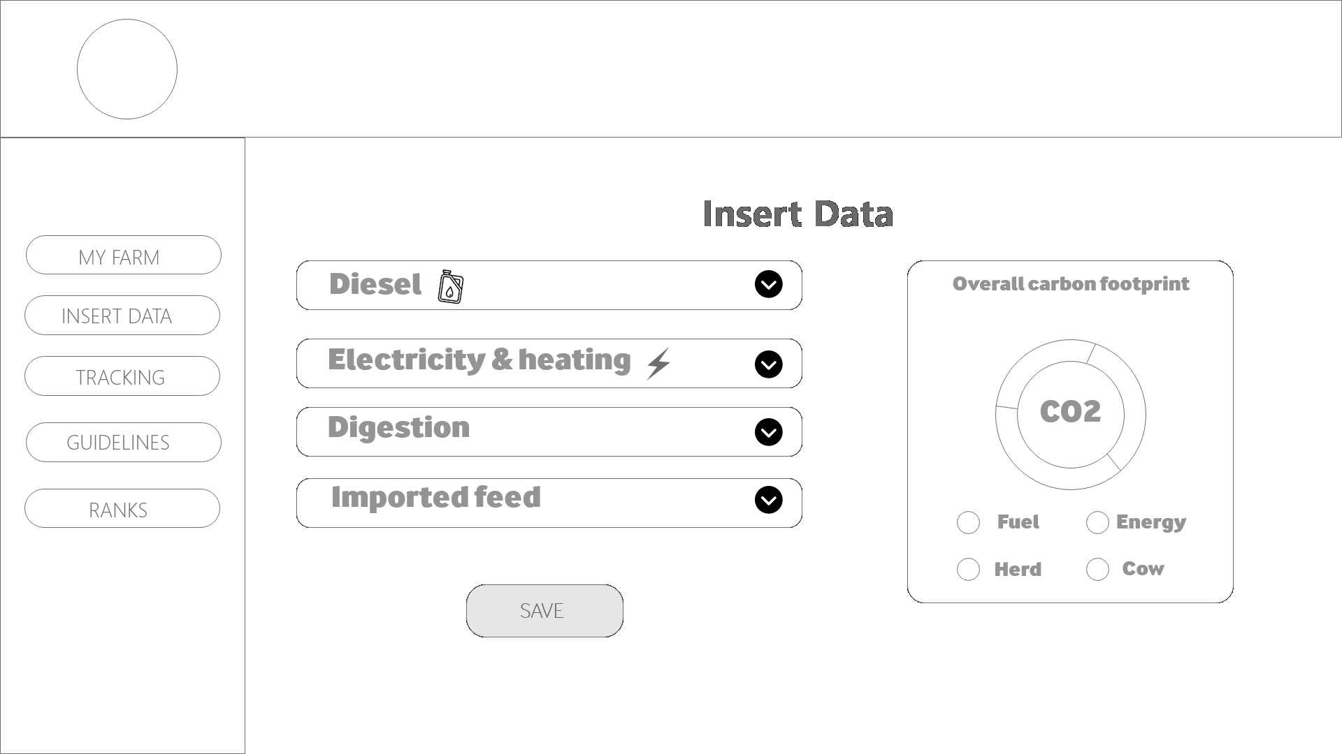
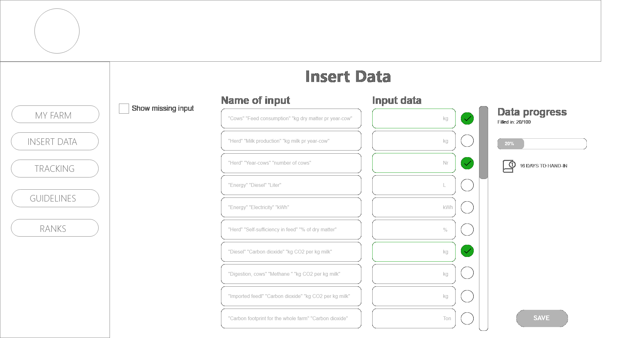
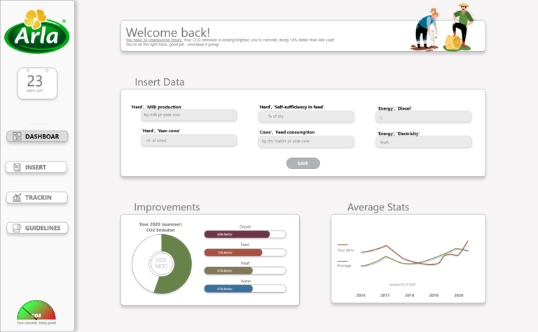
While wireframing, our biggest challenge proved to be the dashboard with its “Insert data” section. We were provided with a tablesheet by Arla which was rather complex. For this reason, we came up with different ways of what we could make.
The final verdict
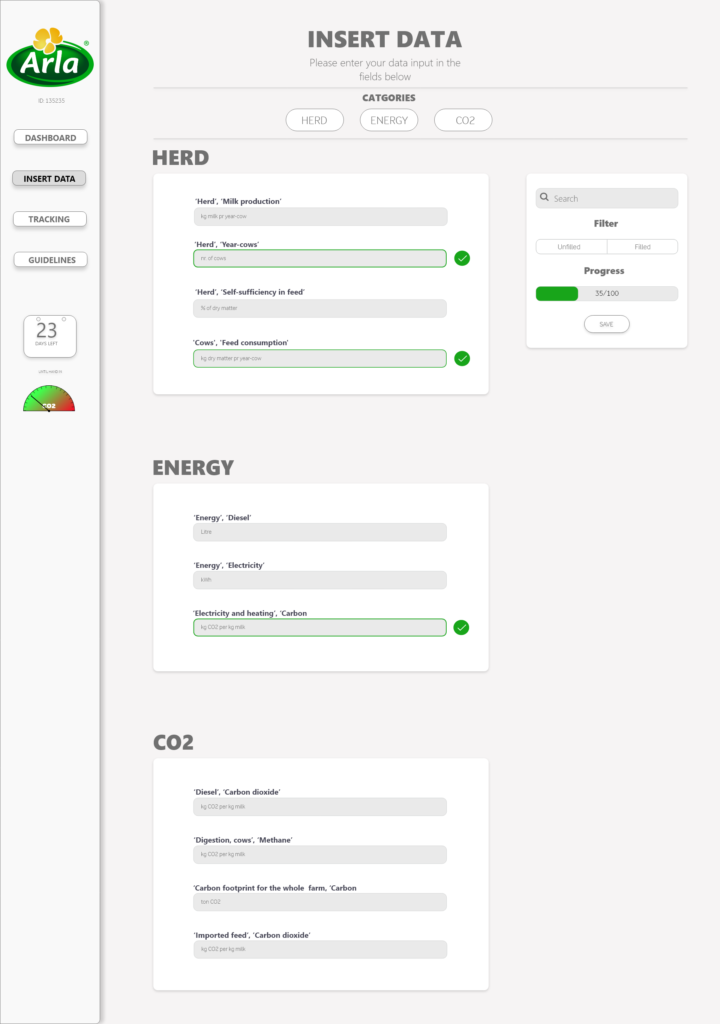
To solve this problem, we decided to have all questions in one page, sorted into categories. In this way, we aimed to make an intuitive experience – the user sees a headline of the field and below, in the field itself they can see an opaque text which tells them the measurement of what they are filling in.
We spent a lot of our time discussing, making wireframes and negotiating what to include while designing the other pages as well. As a guiding point, we tried to answer 3 questions three important questions which influenced the design:
- What should we prioritize?
- Which information is important for the users and how do we show it?
- Which features are useful, and why?
Enhancing the user experience
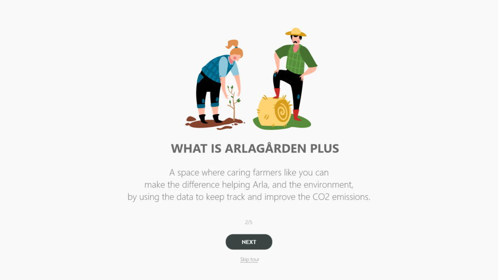
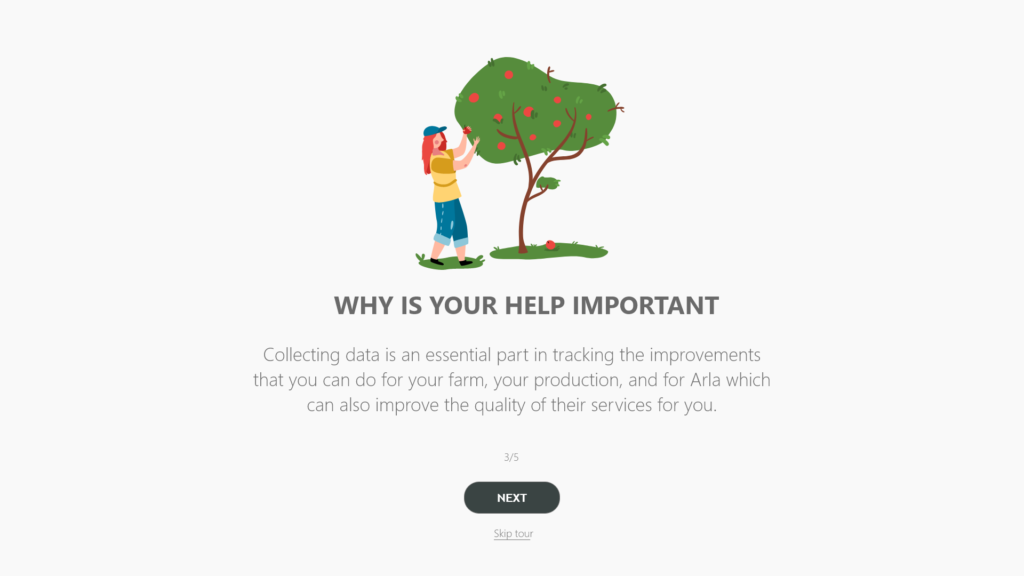
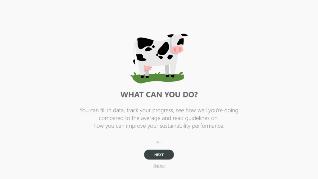
We wanted to make a solution which everyone understands. For that reason, we made a (skippable) walkthrough – a short guide explaining how to use the solution and what are its functionalities. This is meant to help people who are new to the solution and are not familiar with those types of systems.
Testing
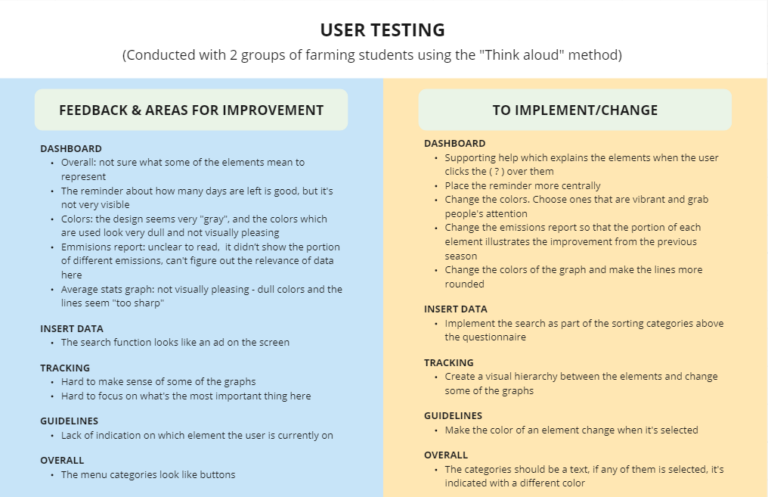
We conducted a testing with 2 groups of farming students using the “Think aloud” method – while the users explored the solution, we asked them to tell us what they think and how they feel about it. The feedback which we got from them helped us a lot with improving our solution even more, and we were very appreciative of it.
Presenting the solution
The project was part of my Multimedia design studies, and done in collaboration with Arla. We had the pleasure to present our solution to the UX Lead of Arla and receive feedback from him before we went to our exam. Overall, he was impressed with our result and thought we came a long way by making informed decisions about the design, based on the user research we were provided with and the insights we drew from it.
Each of us also did well in the individual exam. Our teachers thought we tackled the challenge very well and handled our presentations very profesionally by giving insights and our “behind-the-scene” thoughts about the process.
Reflections and learning
It was truly a pleasure for me to work on this project. First, because I learned so many good things and ways to depict findings during the process of understanding the problem. Second, because my teammates were dedicated to work hard on the project and we also had great synergy between us – each person found an area where they are good and can contribute. The process was an excellent depiction of the Design Thinking and the many iterations which occur along the way.
To sum up, this project and the work we’ve done on it really set up the standard of how to work and collaborate with people in a team.
